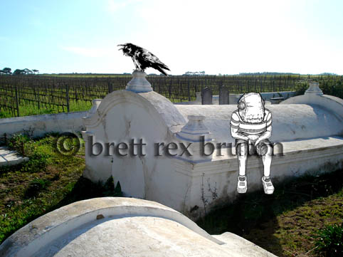
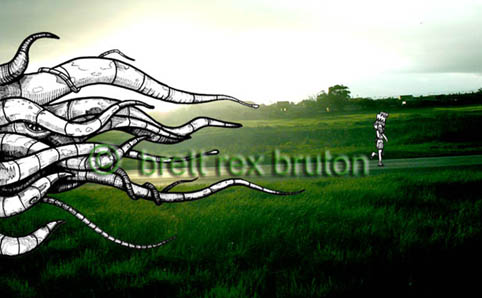
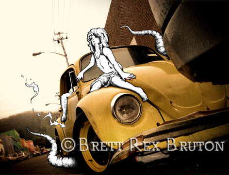
Done with pen and Copics marker. Yo.
Showing posts with label brett bruton. Show all posts
Showing posts with label brett bruton. Show all posts
Friday, July 25, 2008
Tuesday, October 16, 2007
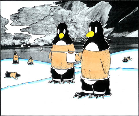
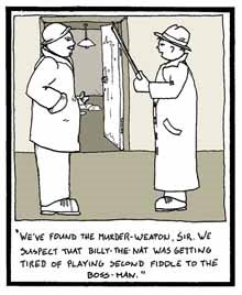
Hot Penguins - Obrigado
My latest work post is, ironically, my second earliest of the posted works so far. The original image was branded by Vida e Caffe and used in the June 2007, Green issue of Obrigado magazine. This image is almost identical, aside from some minor colour changes, and was presented alongside the winning picture for the proposal. In my haste to send off the original, however, i forgot to scan it in first and so i present to you this alternative work in its stead.
I considered Photoshoping up a work more similar to the origional, but the two works are so similar that i decided not to (just imagine the background snow drifts as a light shade of blue and a drop shadow beneath the cetral two penguins).
This work was more fun that a conduit for some deeper meaning - we're talking penguins drinking hot chocolate here...

Oh, and this one isn't for sale ('cause i'm pretty sure that it would be illegal).
Saturday, October 13, 2007
Poorboy Illustration
Conceptual illustration and design.
I focus on tactile illustration - doing as much as possible with a pen, pencil and paper and staving off any digital intervention until it is absolutely necessary. I prefer the unique quality of a hand rendered illustration, and I invest in it far more value than, say, a vector rendered image or logo. My feeling is, if you can do it by hand, then do it. It's the best way to breath life into an illustration, and it's that energetic quality that separates hand rendered illustration from generic, digital renderings.
Recently, i've been working a lot with combining illustration and photography - taking a photograph and drawing (excuse the pun) inspiration from what might otherwise be a banal and uninteresting scene.
Every image has the potential to be more than it is, and i like to try and draw out that potential and weave it into something creative.
I also like to work with a strong concept that i can try and convey through my work and I like to think that i succeed at this, to greater or lesser effect. However, should worse come to worse, i'm not adverse to a pretty picture.
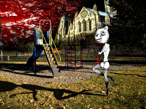
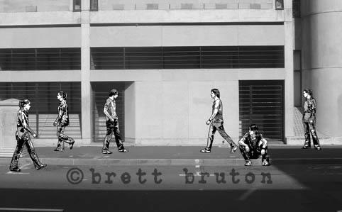
This picture is a good example of some of my new work. The title is Missed You (a street scene) and deals with ideas like miscommunication and the lost narrative that exists in the spaces between people. It's the first black and white image i've completed.

I focus on tactile illustration - doing as much as possible with a pen, pencil and paper and staving off any digital intervention until it is absolutely necessary. I prefer the unique quality of a hand rendered illustration, and I invest in it far more value than, say, a vector rendered image or logo. My feeling is, if you can do it by hand, then do it. It's the best way to breath life into an illustration, and it's that energetic quality that separates hand rendered illustration from generic, digital renderings.
Recently, i've been working a lot with combining illustration and photography - taking a photograph and drawing (excuse the pun) inspiration from what might otherwise be a banal and uninteresting scene.
Every image has the potential to be more than it is, and i like to try and draw out that potential and weave it into something creative.
I also like to work with a strong concept that i can try and convey through my work and I like to think that i succeed at this, to greater or lesser effect. However, should worse come to worse, i'm not adverse to a pretty picture.
This picture is a good example of some of my new work. The title is Missed You (a street scene) and deals with ideas like miscommunication and the lost narrative that exists in the spaces between people. It's the first black and white image i've completed.

Subscribe to:
Posts (Atom)


+blog.jpg)