Friday, July 17, 2009


Monday, November 17, 2008
Pencils and Photostats
So it's been a while since i posted anything - life keeping me busy and all that.
I got this work back a little while ago. I haven't seen it in about a year. Originally, i can't say that i was a fan of it, but now that a bit of time has passed, it seems to have grown on me.
It's simple, but effective - i think. And it's all done by hand: pencil, photostats and glue.

I got this work back a little while ago. I haven't seen it in about a year. Originally, i can't say that i was a fan of it, but now that a bit of time has passed, it seems to have grown on me.
It's simple, but effective - i think. And it's all done by hand: pencil, photostats and glue.

Monday, October 6, 2008
Lectcha Sketch 12 and 13!
Here are two new comics for your perusal.
I once said that i wouldn't be posting my Lectcha Sketch comics here as they were mostly rush-jobs, done more for my own fun than to impress anyone. However, I've started taking a bit more time with my later strips and i think that they are finally getting to a level where i can feel ok posting them on Poorboy.
They're a little off-sides, but that's the point. Enjoy.


I once said that i wouldn't be posting my Lectcha Sketch comics here as they were mostly rush-jobs, done more for my own fun than to impress anyone. However, I've started taking a bit more time with my later strips and i think that they are finally getting to a level where i can feel ok posting them on Poorboy.
They're a little off-sides, but that's the point. Enjoy.


Friday, September 5, 2008
Garbie Storyboard
This here is an attempt to campaign my earlier Garbie ads into an animated TV commercial.
I think it's pretty cool.


I think it's pretty cool.


Wednesday, July 30, 2008
Freedom of Expression

I did this work to promote freedom of expression (duh...) as well as to attack the censoring of our media.
There's always been a bit of whoo-hah with regards to the freedom of the South African press, as well as ohther news madia. With our nation's main broadcaster, the SABC, having extremely strong political affiliations - the board was hand picked by our ever absent president himself, if you can believe that - the chances of a free and fair media in our country are virtually nil.
Case in point: at the recent ANC party elections in Polokwane (our ruling governmental party, for those who don't know), the only other broadcaster in our country - the independent E-TV - was banned from entering. Is it any wonder that virtually everyone I know prefers the E-TV news above it's dubious counterpart?
Anyway, this came with a poster - which was photographic, mostly - which you can see a small pic of only my These Creases blog, and a T-shirt. Oh, and it was drawn with the FXI (Freedom of Expression Institute) in mind.
Friday, July 25, 2008

Wednesday, June 18, 2008
Garbie: bio-degradable garbage bags


So photoshop is the greatest digital arts/image software ever invented, right? I mean, there's nothing you cant do with the thing. As far as I know, the whole of the first Toy Story movie was made using the thing (I freely admit that my imagination may have made that up based on some single kernel of info, but I couldn't be bothered to check).
Riddle me this then: Why, when now even the common man (with at least R3000 in his pocket) has access to some of the best image software ever, do the everyday printing facilities of the world seem to still struggle pirinting something as simple as a gradient? Easily one of the most useful and versatile and simple tools available on any imaging software and there isn't a single place in Cape Town that can manage a decent gradient for less than R40 a page. There's gotta be some secret spot that has so far alluded me because everyday I see a multitude of prints in a cacophony of colours gleaming happily at me from walls and between the pages of various publications and yet I can't seem to get a print where my beautiful green gradient doesn't turn vomit yellow at some crucial point.
I watched a documentary last night in which a woman believed that she was suffering bad karma from a past life. Makes me think...
Turned out okay in the end though. Printed and done (severeal times over).
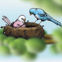
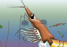
Just in case you some how missed it, this was a campaign (mock again) for Garbie bio-degradable garbage bags. I didn't initially intend for it to turn into an illustrated work, but when I settled on the final idea it seemed to make the most sense. I considered the potential obstacles involved when trying to art-direct two sea turtles and thought better of it.
A big-up to Gary Larson, who's influence was pointed out to me and which is undeniable, even if I didn't realise it myself at first.
Peachy.
Sunday, June 1, 2008
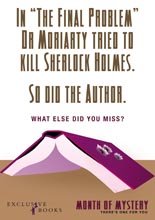
Exclusive Books: Month of Mystery mock campaign

Poster #1

Poster #2

Mailer Front

Mailer Back

Promotional Bag
Monday, May 19, 2008
Some new works on their way
I'll be beginning work on a new black and white series in the near future.
I can't tell you what they'll be about yet (mostly because they're still in the conceptual phases) but I can say that there will be between three and five final works.
I have been "commissioned" to create this series of works to decorate some friends' new flat's living room. What this all means is that I'll probably score a beer or two out of it, post a few more pics on the blog and get to look at my work on someone else's wall.
All kinds of shweet :)
I can't tell you what they'll be about yet (mostly because they're still in the conceptual phases) but I can say that there will be between three and five final works.
I have been "commissioned" to create this series of works to decorate some friends' new flat's living room. What this all means is that I'll probably score a beer or two out of it, post a few more pics on the blog and get to look at my work on someone else's wall.
All kinds of shweet :)
Kerry Gold Butter


Here is a mock ad campaign for Kerry Gold butter that I recently completed.
I'm obviously posting these specifically for the illustration style, but if you dig the ads... well, that's a plus. The style is a little different to what I usually do - it's a little more "cartoony" obviously, and I've used colour (shock horror!).
As per usual, the illustration and colouring was done by hand.
The ads are supposed to be a dry take on the Irish wit; taking scenarios that could easily be used as backgrounds to an Irish joke and then turning them on their heads.
'Course all that really matters here are the illustrations. Look at the pretty pictures...
Friday, May 16, 2008
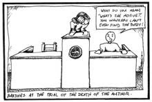
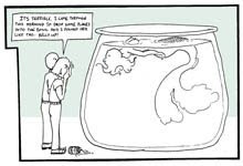
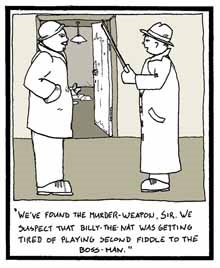
Lectcha Sketch

Lectcha Sketch is ancient. It's been going for about seven years, I think - in an unofficial capacity - which is more time that I've put into just about anything besides life. It was born out of boredom; out of sitting for hours through various lectures at Rhodes university, doodling on my writing pad as a way of whittling away the hours before The Rat and Parrot opened it's door (which was usually around eleven/twelve AM, but we won't go into that now).
Many an English poetry lecture was spent idly sketching with a ballpoint pen, watching the clock and letting my imagination flop around on the desk like a dying fish.
English lectures were the worst.
You'd think that a course dedicated to the creative literary expression of our language would hold some element of intrigue, but nay, it was not to be. Rather, historical, creative giants such as Shakespeare and Seamus Heaney were dissected and disseminated with as much emotion as one would a laboratory rat: "Here is the heart, here are the lungs, this is what makes it tick, write a thousand words on the Yeats' central nervous system, wash your hands and don't let the swing door hit you in the arse".
It's ironic that those student who were truly interested in the works and literature had to take separate language courses such as Modern Fiction and Afikaans and Nederlandic Studies (pretty sure that's spelt wrong) in order to get a little stimulating discussion. I ended up with the opinion that all English writers are kak and that, for decent, rousing literature, you need to go elsewhere (Italy and South America are my preferred countries).
I digress heavily though.
Boredom wasn't always the main impetus behind the comics. Every now and then I would find myself inspired by some interesting kernel or theory, for what ever reason, and put pen to paper in a way that wasn't particularly academic but definitely amusing (to me at least). For this reason, some of my comics are terribly specific, and often won't be caught by anyone who doesn't know exactly what I'm talking about.
I like to think that the people who do get them feel quite appreciative though - that someone with an Art Theory background will laugh a little bit harder at a certain comic because it feel like an in-joke.
I'm all for in-jokes. You other sods can take it as it comes. ;)
Oddly enough, it is my other blog - These Creases - that has become the home page for my Lectcha Sketch comics. Maybe it's because of their randomness and offbeat style, but it just felt right to post them there first. I guess it's because they're doodles and don't really speak volumes about my illustrative style. For whatever reason though, if you enjoy them and like a little bit of background on each (when there is some) that's the place to go.
Thursday, April 17, 2008
An honourable mention, i guess
I've just discovered that this work is up on the Obrigado illustration wall.
I entered for an illustration comp but it was never published (in all honestly, it was quite a way off the brief, but i thought that I'd take a shot anyway).
There's a bunch of other really cool stuff by a few people, including a few friends of mine, so go take a look at http://www.obrigado.co.za/?p=392.

I entered for an illustration comp but it was never published (in all honestly, it was quite a way off the brief, but i thought that I'd take a shot anyway).
There's a bunch of other really cool stuff by a few people, including a few friends of mine, so go take a look at http://www.obrigado.co.za/?p=392.

Wednesday, April 16, 2008
A LIttle Summin-Summin'
I've decided that, as much as I prefer my more traditional mediums, it's pretty silly of me to not have a decent, working knowledge of the various digital prgrams out there, so i've decided to try a little digital clouring.
This work has the unbelievably origional name Proffesor Bug-Man! (I try...)
It's not a complete work (hell, it's barely a work a all) but it's my first attempt at digital colouring and I thought that I'd post it. The lighting sucks, but hey.
Think Baxter meets Jeff Goldbloom...

This work has the unbelievably origional name Proffesor Bug-Man! (I try...)
It's not a complete work (hell, it's barely a work a all) but it's my first attempt at digital colouring and I thought that I'd post it. The lighting sucks, but hey.
Think Baxter meets Jeff Goldbloom...
Saturday, March 22, 2008
These Creases

I have started a new blog titled These Creases.
The blog was created as both a college project and as a personal experiment - it's always helpful when the two come hand-in-hand.
The idea behind it is to try and find a way to conceptually explore the traces that we leave on the world around us and visa versa - those traces that point to an experience that would otherwise be lost to us. I'm not gonna get into the nitty-gritty here as I've written a fair deal on the site itself if you're interested, but the blog includes a few more sketches in a style that is less usual for me as well as my first two attempts at stop motion film. Both are quite amateur, but the experience of making them was a lot of fun - as well as tedious and frustrating at times, regardless of how short the final products are.
I've added a link to These Creases in my side bar - I would have added a link to the title of this post as well, but I no longer seem to have the option and my knowledge of HTML scripting leaves much to be desired.
I hope that you enjoy.
Origional Super Glue mock ad

This is a mock ad that I completed recently for The Original Super Glue.
I know that it's not illustration, but I dig it. I figure that if you don't get it almost immediately then i've probably failed, but no hit and misses so far.
And, of course, if anyone from The Original Super Glue Company sees this, well... I'm a lot cheaper than an agency.
Tuesday, October 16, 2007
Hot Penguins - Obrigado
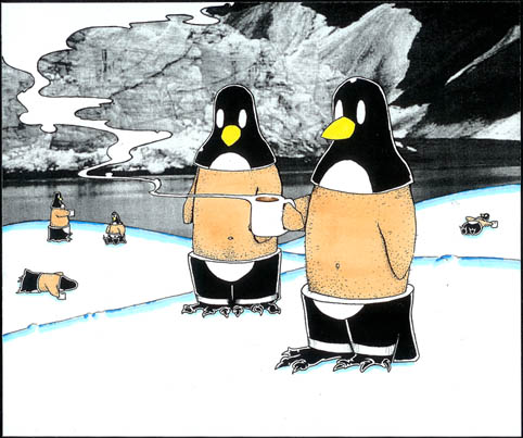
My latest work post is, ironically, my second earliest of the posted works so far. The original image was branded by Vida e Caffe and used in the June 2007, Green issue of Obrigado magazine. This image is almost identical, aside from some minor colour changes, and was presented alongside the winning picture for the proposal. In my haste to send off the original, however, i forgot to scan it in first and so i present to you this alternative work in its stead.
I considered Photoshoping up a work more similar to the origional, but the two works are so similar that i decided not to (just imagine the background snow drifts as a light shade of blue and a drop shadow beneath the cetral two penguins).
This work was more fun that a conduit for some deeper meaning - we're talking penguins drinking hot chocolate here...

Oh, and this one isn't for sale ('cause i'm pretty sure that it would be illegal).
I considered Photoshoping up a work more similar to the origional, but the two works are so similar that i decided not to (just imagine the background snow drifts as a light shade of blue and a drop shadow beneath the cetral two penguins).
This work was more fun that a conduit for some deeper meaning - we're talking penguins drinking hot chocolate here...

Oh, and this one isn't for sale ('cause i'm pretty sure that it would be illegal).
Saturday, October 13, 2007
Order info and freelance
If you see anything on this blog that you like and you would like to order a print, feel free to contact me via e-mail.
I can do matt, gloss, canvas and vinyl.
If none of these suit you or you have any special requests, again, feel free to contact me and i'm sure we can work something out.
Also, if you like my style and want something specific and unique, i do freelancing and commissioned works.
I can do matt, gloss, canvas and vinyl.
If none of these suit you or you have any special requests, again, feel free to contact me and i'm sure we can work something out.
Also, if you like my style and want something specific and unique, i do freelancing and commissioned works.
Poorboy Illustration
Conceptual illustration and design.
I focus on tactile illustration - doing as much as possible with a pen, pencil and paper and staving off any digital intervention until it is absolutely necessary. I prefer the unique quality of a hand rendered illustration, and I invest in it far more value than, say, a vector rendered image or logo. My feeling is, if you can do it by hand, then do it. It's the best way to breath life into an illustration, and it's that energetic quality that separates hand rendered illustration from generic, digital renderings.
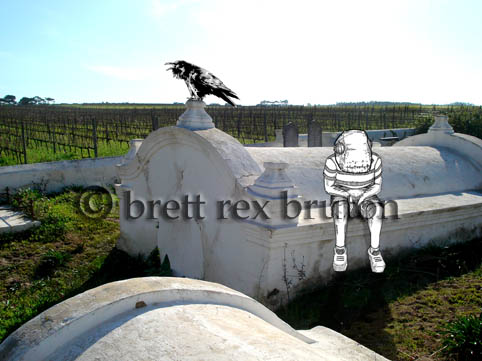
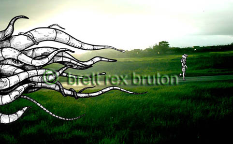
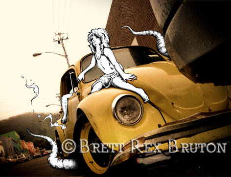
Recently, i've been working a lot with combining illustration and photography - taking a photograph and drawing (excuse the pun) inspiration from what might otherwise be a banal and uninteresting scene.
Every image has the potential to be more than it is, and i like to try and draw out that potential and weave it into something creative.
I also like to work with a strong concept that i can try and convey through my work and I like to think that i succeed at this, to greater or lesser effect. However, should worse come to worse, i'm not adverse to a pretty picture.
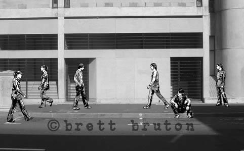
This picture is a good example of some of my new work. The title is Missed You (a street scene) and deals with ideas like miscommunication and the lost narrative that exists in the spaces between people. It's the first black and white image i've completed.

I focus on tactile illustration - doing as much as possible with a pen, pencil and paper and staving off any digital intervention until it is absolutely necessary. I prefer the unique quality of a hand rendered illustration, and I invest in it far more value than, say, a vector rendered image or logo. My feeling is, if you can do it by hand, then do it. It's the best way to breath life into an illustration, and it's that energetic quality that separates hand rendered illustration from generic, digital renderings.
Recently, i've been working a lot with combining illustration and photography - taking a photograph and drawing (excuse the pun) inspiration from what might otherwise be a banal and uninteresting scene.
Every image has the potential to be more than it is, and i like to try and draw out that potential and weave it into something creative.
I also like to work with a strong concept that i can try and convey through my work and I like to think that i succeed at this, to greater or lesser effect. However, should worse come to worse, i'm not adverse to a pretty picture.
This picture is a good example of some of my new work. The title is Missed You (a street scene) and deals with ideas like miscommunication and the lost narrative that exists in the spaces between people. It's the first black and white image i've completed.

'Sup world
Here we go.
I haven't got much to say at the moment, which is fine because who's gonna read it just yet?
Once i figure this out, this blog is going to be spectacularly interesting. Promise. 'till then, you, the hypothetical masses, are just gonna have to bare with me.
I haven't got much to say at the moment, which is fine because who's gonna read it just yet?
Once i figure this out, this blog is going to be spectacularly interesting. Promise. 'till then, you, the hypothetical masses, are just gonna have to bare with me.
Subscribe to:
Posts (Atom)








+blog.jpg)