Illustration, Arts Direction, Fine Art and Design


Saturday, March 22, 2008

These Creases


I have started a new blog titled These Creases.

The blog was created as both a college project and as a personal experiment - it's always helpful when the two come hand-in-hand.

The idea behind it is to try and find a way to conceptually explore the traces that we leave on the world around us and visa versa - those traces that point to an experience that would otherwise be lost to us. I'm not gonna get into the nitty-gritty here as I've written a fair deal on the site itself if you're interested, but the blog includes a few more sketches in a style that is less usual for me as well as my first two attempts at stop motion film. Both are quite amateur, but the experience of making them was a lot of fun - as well as tedious and frustrating at times, regardless of how short the final products are.

I've added a link to These Creases in my side bar - I would have added a link to the title of this post as well, but I no longer seem to have the option and my knowledge of HTML scripting leaves much to be desired.

I hope that you enjoy.

Origional Super Glue mock ad


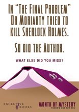
This is a mock ad that I completed recently for The Original Super Glue.

I know that it's not illustration, but I dig it. I figure that if you don't get it almost immediately then i've probably failed, but no hit and misses so far.

And, of course, if anyone from The Original Super Glue Company sees this, well... I'm a lot cheaper than an agency.

Tuesday, October 16, 2007

Hot Penguins - Obrigado

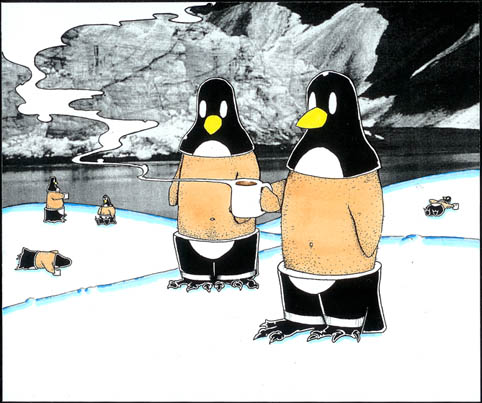
My latest work post is, ironically, my second earliest of the posted works so far. The original image was branded by Vida e Caffe and used in the June 2007, Green issue of Obrigado magazine. This image is almost identical, aside from some minor colour changes, and was presented alongside the winning picture for the proposal. In my haste to send off the original, however, i forgot to scan it in first and so i present to you this alternative work in its stead.

I considered Photoshoping up a work more similar to the origional, but the two works are so similar that i decided not to (just imagine the background snow drifts as a light shade of blue and a drop shadow beneath the cetral two penguins).

This work was more fun that a conduit for some deeper meaning - we're talking penguins drinking hot chocolate here...


Oh, and this one isn't for sale ('cause i'm pretty sure that it would be illegal).

Saturday, October 13, 2007

Order info and freelance

If you see anything on this blog that you like and you would like to order a print, feel free to contact me via e-mail.

I can do matt, gloss, canvas and vinyl.

If none of these suit you or you have any special requests, again, feel free to contact me and i'm sure we can work something out.

Also, if you like my style and want something specific and unique, i do freelancing and commissioned works.

Poorboy Illustration

Conceptual illustration and design.
I focus on tactile illustration - doing as much as possible with a pen, pencil and paper and staving off any digital intervention until it is absolutely necessary. I prefer the unique quality of a hand rendered illustration, and I invest in it far more value than, say, a vector rendered image or logo. My feeling is, if you can do it by hand, then do it. It's the best way to breath life into an illustration, and it's that energetic quality that separates hand rendered illustration from generic, digital renderings.

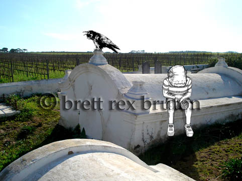
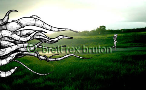
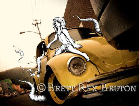
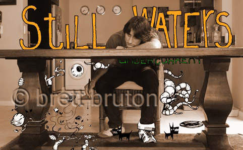
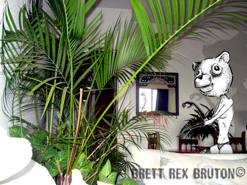
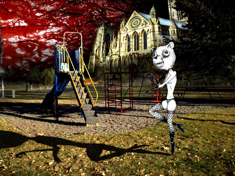
Recently, i've been working a lot with combining illustration and photography - taking a photograph and drawing (excuse the pun) inspiration from what might otherwise be a banal and uninteresting scene.
Every image has the potential to be more than it is, and i like to try and draw out that potential and weave it into something creative.

I also like to work with a strong concept that i can try and convey through my work and I like to think that i succeed at this, to greater or lesser effect. However, should worse come to worse, i'm not adverse to a pretty picture.

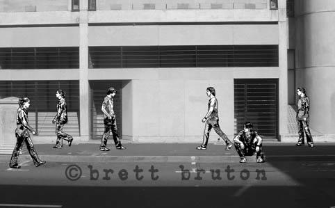
This picture is a good example of some of my new work. The title is Missed You (a street scene) and deals with ideas like miscommunication and the lost narrative that exists in the spaces between people. It's the first black and white image i've completed.

'Sup world

Here we go.

I haven't got much to say at the moment, which is fine because who's gonna read it just yet?

Once i figure this out, this blog is going to be spectacularly interesting. Promise. 'till then, you, the hypothetical masses, are just gonna have to bare with me.